- Introduction
- Troubleshooting: Style
<label/>element based on radio input state - Troubleshooting:
<RadioGroupItem/>should be hidden from the screen but still be accessible - Using
height: 0attribute - Using
sr-onlyclassName in tailwindCSS - Form Component
- Conclusion
- References
Radix-UI is a headless UI library that guarantees accessibility and ShadCN UI are components built on top of it, styled with tailwindCSS. These libraries are leading the trend and I got curious about them, so I jumped into it and I'm using them in my project. So far, I'm satisfied with its approach, but there were some issues since I missed some details while they abstracted away the HTML. In this post, I will talk about the issues I had while styling and customizing ShadCN UI Components.

- It should satisfy the styling of the given design.
- Both buttons should work as radio buttons
- It should take accessibility into consideration
Since ShadCN UI already takes consider of accessibility and radio functionalities are supported, I decided to use RadioGroup and RadioGroupItem.
peer-{modifier} lets style a specific element based on sibling state. You can the sibling element with peer className and style the target element by using peer-{modifier} like peer-checked/peername:bg-green.
Here's the blueprint of the code.
<RadioGroup>
  <RadioGroupItem className="peer/overview" value="overview" id="overview" />
  <Label htmlFor="overview" className="peer-checked/overview:border-pink">
    ...
  </Label>
</RadioGroup>
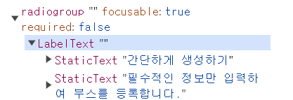
However, the <Label/> element was not styled with the peer-checked/overview:border-pink className. I wrapped my head around this issue for a few hours, closely looked at Chrome Devtools for a few hours, and found the reason why it doesn't work.
HTML Element on Chrome Devtools
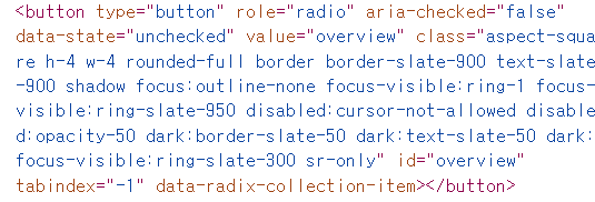
The actual rendered result of <RadioGroupItem/> component is <button aria-role="radio"/>, instead of <input type="radio"/>. checked. CSS does not evaluate aria-role unless it's specified directly like this:
[role="checked"] {
  background-color: white;
}
At this stage, I realized it's not feasible to style <label/> based on <input/> state here, so I moved forward with another approach: dynamic styling.
Since I saw that it's difficult to manage the input state(checked) supported in native HTML in this case, I managed the state by using useState() react hook. After that, I constructed a dynamic className computed with the state and injected it.
At first, I tried it like this.
- Note that
onValueChange()is the event handler prop for<RadioGroup/>Component. - Note that
checkedprop is used in<RadioGroupItem/>Component. - The dynamic style
border-pink even:text-pinkof<Label/>specifies the text color of its second child element.
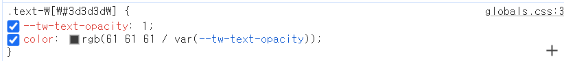
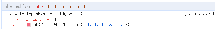
However, this element had a limitation. Since the direct declaration(className='text-black') is applied by @utilities and the pseudoclass(even:text-pink) is applied by @base in the global.css file, className='text-black takes precedence over the pseudoclass and the text color of the second child doesn't change even if the radio button is set to checked. You can check the results below provided by Chrome Devtools.
- Applied text color on Chrome Devtools
- Overrided text color on Chrome Devtools
- The order of tailwind styling

Therefore, instead of staying the child element in the parent component, I was bound to pass the js expression to the child component.
Here's the refactored code.
<RadioGroup value={selectedOption} onValueChange={setSelectedOption}>
  <RadioGroupItem
    value="overview"
    id="overview"
    checked={selectedOption === "overview"}
  />
  <Label
    htmlFor="overview"
    className={`${
      selectedOption === "overview" ? "border-pink even:text-pink" : ""
    }`}
  >
    <div>...</div>
    <div className="text-black">
      this should turn pink when its radio input is checked, but it's still
      black.
    </div>
  </Label>
</RadioGroup>
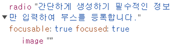
It was necessary to hide radio buttons and display only labeled texts.
This attribute removes the element from the accessibility tree, causing the UI to be inaccessible to screen readers.
<RadioGroupItem
  className="hidden"
  value="overview"
  id="overview"
  checked={selectedOption === "overview"}
/>
This attribute also eliminates the element from the tree. Plus, the element still takes up the box of the area.
<RadioGroupItem
  className="invisible"
  value="overview"
  id="overview"
  checked={selectedOption === "overview"}
/>
It also removes the element from the tree.
sr-only applies the following CSS attributes to the element.
position: absolute;
width: 1px;
height: 1px;
padding: 0;
margin: -1px;
overflow: hidden;
clip: rect(0, 0, 0, 0);
white-space: nowrap;
border-width: 0;
It hides the element from the screen completely. Plus it's still accessible.
ShadCN UI introduces how to use its <Form /> component. However, it was my first time using react-hook-form and runtime validation library zod altogether, so I didn't have any clue how I should write down some code. I decided to break all the example into pieces and take a look at what's really going on.
Here's the example. It's quite overwhelming.
  return (
    <Form {...form}>
      <form onSubmit={form.handleSubmit(onSubmit)} className="space-y-8">
        <FormField
          control={form.control}
          name="username"
          render={({ field }) => (
            <FormItem>
              <FormLabel>Username</FormLabel>
              <FormControl>
                <Input placeholder="shadcn" {...field} />
              </FormControl>
              <FormDescription>
                This is your public display name.
              </FormDescription>
              <FormMessage />
            </FormItem>
          )}
        />
        <Button type="submit">Submit</Button>
      </form>
    </Form>
  )
}
You define schema using this library. Schema is a set of more strict rules for each data type than static typescript.
react-hook-form helps you build forms faster and more performant. Each child component wouldn't cause rerender of any other children components.
useForm()useForm()hook returns form state including props likeregister,handleSubmitandformState.
export default function App() {
  const {
    register,
    handleSubmit,
    watch,
    formState: { errors },
  } = useForm<Inputs>()
  const onSubmit: SubmitHandler<Inputs> = (data) => console.log(data)
-
<FormProvider/>: Thisreact-hook-formcomponent allows your components to subscribe to theuseForm()props and methods. -
<FormField/>:This component providesnamecontext to<Controller />component.<Controller />component is areact-hook-formcomponent that gets props such as 'name', 'control', 'render'. A blog post here explains render prop pattern in detail, so check it out if you're interested.
const FormField = <
  TFieldValues extends FieldValues = FieldValues,
  TName extends FieldPath<TFieldValues> = FieldPath<TFieldValues>,
>({
  ...props
}: ControllerProps<TFieldValues, TName>) => {
  return (
    <FormFieldContext.Provider value={{ name: props.name }}>
      <Controller {...props} />
    </FormFieldContext.Provider>
  );
};
useFormField(): it extracts all the values given byFormFieldContext,FormItemContext, anduseFormContext().useFormContext()allows you to access form state(getFieldStateandformStateprops). It returnsfieldState,formItemIdfor each item,formDescriptionId,formMessageId, etc.
const useFormField = () => {
  const fieldContext = React.useContext(FormFieldContext);
  const itemContext = React.useContext(FormItemContext);
  const { getFieldState, formState } = useFormContext();

  const fieldState = getFieldState(fieldContext.name, formState);

  if (!fieldContext) {
    throw new Error("useFormField should be used within <FormField>");
  }

  const { id } = itemContext;

  return {
    id,
    name: fieldContext.name,
    formItemId: `${id}-form-item`,
    formDescriptionId: `${id}-form-item-description`,
    formMessageId: `${id}-form-item-message`,
    ...fieldState,
  };
};
<FormItem/>: This component generates an unique accessibility id for each component and wraps its children with the id Provider.
const FormItem = React.forwardRef<
  HTMLDivElement,
  React.HTMLAttributes<HTMLDivElement>
>(({ className, ...props }, ref) => {
  const id = React.useId();

  return (
    <FormItemContext.Provider value={{ id }}>
      <div ref={ref} className={cn("space-y-2", className)} {...props} />
    </FormItemContext.Provider>
  );
});
<FormLabel/>: This component getserror,formItemIdfromuseFormField()hook.erroris used to style the label text, andformItemIdis used to refer to the target form item usinghtmlForattribute.
const FormLabel = React.forwardRef<
  React.ElementRef<typeof LabelPrimitive.Root>,
  React.ComponentPropsWithoutRef<typeof LabelPrimitive.Root>
>(({ className, ...props }, ref) => {
  const { error, formItemId } = useFormField();

  return (
    <Label
      ref={ref}
      className={cn(error && "text-red-500 dark:text-red-900", className)}
      htmlFor={formItemId}
      {...props}
    />
  );
});
<FormControl/>: This component getserror,formItemId,formDescriptionId,formMessageIdfromuseFormField()hook.Slotcomponent merges props onto its immediate child. You can see the full code in its repo.
const FormControl = React.forwardRef<
  React.ElementRef<typeof Slot>,
  React.ComponentPropsWithoutRef<typeof Slot>
>(({ ...props }, ref) => {
  const { error, formItemId, formDescriptionId, formMessageId } =
    useFormField();

  return (
    <Slot
      ref={ref}
      id={formItemId}
      aria-describedby={
        !error
          ? `${formDescriptionId}`
          : `${formDescriptionId} ${formMessageId}`
      }
      aria-invalid={!!error}
      {...props}
    />
  );
});
<FormDescription/>: This component getsformDescriptionIdfromuseFormField()hook.formDescriptionIdis used to target the element and refer to it usingaria-describedbyin the input element.
const FormDescription = React.forwardRef<
  HTMLParagraphElement,
  React.HTMLAttributes<HTMLParagraphElement>
>(({ className, ...props }, ref) => {
  const { formDescriptionId } = useFormField();

  return (
    <p
      ref={ref}
      id={formDescriptionId}
      className={cn(
        "text-[0.8rem] text-slate-500 dark:text-slate-400",
        className,
      )}
      {...props}
    />
  );
});
<FormMessage/>: This component getsformMessageId,errorfromuseFormField()hook.formMessageIdis used to target the element with the id and refer to it usingaria-describedbyin the input element.erroris used to display the error message.
const FormMessage = React.forwardRef<
  HTMLParagraphElement,
  React.HTMLAttributes<HTMLParagraphElement>
>(({ className, children, ...props }, ref) => {
  const { error, formMessageId } = useFormField();
  const body = error ? String(error?.message) : children;

  if (!body) {
    return null;
  }

  return (
    <p
      ref={ref}
      id={formMessageId}
      className={cn(
        "text-[0.8rem] font-medium text-red-500 dark:text-red-900",
        className,
      )}
      {...props}
    >
      {body}
    </p>
  );
});
ShadCN UI is a powerful tool since you don't need to write all the repeated HTML/CSS. Custom styling ShandCN UI components might be tricky since they abstract away everything, so it's necessary to stay up to date with Radix-UI docs.
Styling based on sibling state - Official Docs Dynamic class names - Official Docs Specificity - MDN zod FormProvider useForm useFormContext getFieldState Controller Render Props Pattern